Countdown: Interactive Sketchbook 2.0 – Part III

THE COUNTDOWN IS OVER!

Version 2.0 is finally live in the App Store.  This version is totally rewritten from the ground up to be more stable, have more features, and have more performance.  We’ve also engineered it to be easy to maintain and update far into the future.  More Updates & Features to come!!!

ISB_AppStore_v4_cropped

Click the icon above to see Interactive Sketchbook in the App Store!  Below is a peak at what the new version looks like when sketching from your photo reference.

InteractiveSketchbook2screen4-1

Countdown: Interactive Sketchbook 2.0 – Part II

EVOLUTION OF AN ICON

Interactive Sketchbook 2.0 is just weeks away from being complete.  And as we continue to finish up the next version I wanted to share some of the process of shaping the icon along the way.

Original Version

This is the version of the icon that is currently in the app store.  While not bad, there were lots of ways to improve it, especially the way it looks on the higher resolution of a retina screen.


Improving For Retina

V1 below is effectively what the original icon looked like when viewed on a retina screen.  Fuzzy and pixelated.  Creating anything that looked better was one of the first priorities once I had early builds of the new version running.  V2 has all the assets swapped out and rendered in the appropriate resolution.  The extra detail of v2 improved the icon quite a bit, and so it was left alone for several weeks. (It no longer hurt my eyes on a retina iPad.  Notice the extra detail in the face and text.)  V3 changed the thickness of the pencil.  I probably made v2’s pencil too fat, and though it was certainly iconic, I wanted our icon to feel a little more professional, and less cartoony or kid like.

v1v2v3

Bring in the Graphic Designer

V3 was left alone for months as I focused on implementing the UI for the App.  Once I had enough of the interface working I began to work with Graphic Designer Tim Whalen.  Tim created beautiful new assets for almost everything in version 2.0 of Interactive Sketchbook!  In the last month or so we’ve been jumping back to work on the icon with the new interface assets.

V4 uses our new pencil asset.  The new pencil is a more highly detailed illustration, yet it is cleaner than a photographic asset.  However we felt that something about it was unbalanced once it was shrunk down to the size of the icon.  But it wasn’t worth getting too caught up in tweaking until we had replaced some of the other assets in the icon.  V5 we swapped out the old binder for a new one.  The new binder has a neat wrap around effect where you can see the coils curl back behind the sketchbook.  This makes the icon really look like a sketchbook, but after living with it for awhile it seemed to make the icon feel like less of a touchable button.  V6 we simplified the binder.  And though a lot of detail was thrown out, I think the result is much more inviting.

v4v5v6

Almost There

For V7 we have increased the contrast on the pencil and added an outline to help it pop from the sketchbook background.  Adding a deeper shadow on the pencil also made the icon a bit more pleasant to look at.  With the deeper shadow my eyes tend to focus mostly on the face and pencil, whereas before the icon would draw my eye too many places at once.  We’ve also replaced the original texture for a newer one that is more subtle and organic.

v7

At this point the icon is fairly good.  There are some likely last minute tweaks that will be made before the app launches, but those can wait until we’ve lived with this icon for awhile.  It’s important to have time to let a design sink-in, and time to grow (or not grow) on you.  A lot of work goes into designing even something as simple as an icon, and you might accidentally get attached to a detail that doesn’t improve the design.  Or you may not notice a subtle quality that reveals itself with time.

Bonus Icon Timeline

Here they are all at once so you can see a purely visual progression.

v1v2v3v4v5v6v7

iPad mini: Form Factor & User Interface

A New Tool (A New Toy)

How does the form factor of the iPad mini affect the experience of using software originally meant to run on the full-sized iPad?  Does it just work?  For the most part, the answer seems to be yes.  All the buttons, toolbars, and layouts seem to work just as well with miniaturization.  With one exception…

The Keyboard

With the iPad propped up in landscape with a smart-cover, there is a nearly full-size keyboard to type away on.  When typing something medium to long form this is usually my preferred method.  (Find a table, use the smart-cover for an ergonomic angle, and type away.)

With the Mini however, the landscape keyboard is too cramped for normal touch-typing.  I end up resorting to a “two-finger-per-hand-hunt-and-peck” style of typing.

iPad_mini_landscapeiPad_landscape

In practice with the mini, I seem to prefer this never.  So aside from a bluetooth keyboard, what options does one have?

The Split Keyboard

If only Apple had customized the keyboard experience on the mini to make typing more comfortable.  It turns out they did, but just for the split keyboard!

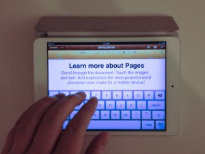
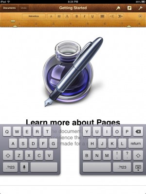
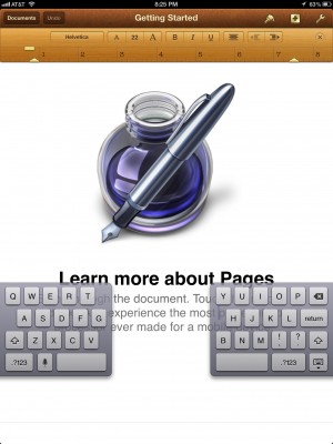
In iOS 5 Apple introduced a new feature called the split keyboard.  It allows you to type like an iPhone by splitting and shrinking the keys.  You can hold your iPad in both hands and thumb type  – all while losing less screen real estate to the keyboard.  This quickly became my default mode of text entry for shorter writing on my iPad.  On the mini, I now use it for everything.
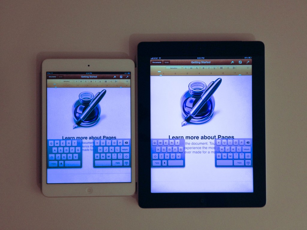
 

iPad Split Keyboards

Feels The Same

You might think those look the same.  I didn’t notice a difference at first.  Probably because my fingers didn’t feel a difference.  But the difference is huge!  Apple enlarged the split keyboard to offset the shrink in form factor of the iPad mini.  Check it out below. (iPad mini on the left, full-size iPad on the right.)

iPad_mini_Split_KeyboardiPad_Split_Keyboard

Should I Enlarge My User Interface?

As a developer, this is a question that needs to be pondered (and tested).  In most cases, I think the answer is no.  With the exception of the split keyboard, apple didn’t change ANYTHING* across all of iOS for the iPad mini.  But in this one case, it made a huge difference.  In instances where the UI is trying to mimic the feel of a real world tangible object, it is worth considering.

Sweat the details, it makes a difference!

*UPDATE: Apple also enlarged the font and icon size on the non split keyboards within each key on the mini.

How To Draw on iPhone 5

Version 1.1 of How To Draw* will be hitting the AppStore soon with full compatibility for iPhone 5 and iOS 6.  Here is a comparison of the screen real estate on a 3.5 and 4 inch retina display.


iOS-Simulator-Screen-shot-Sep-16-2012-5.12.28-PMiOS-Simulator-Screen-shot-Sep-16-2012-5.11.49-PM

Is Bigger Better?

In this case the answer appears to be yes.  So much vertical space is lost to status bars and toolbars, that a taller screen ultimately shows more content.  The 4 inch retina display presents the entire drawing canvas at once without having to remove the toolbars by going into fullscreen mode.  This extra screen real estate will be just as useful when zooming into the artwork.

September 21st can’t come soon enough!

*“How To Draw: With Artist Matt Busch!” is available for both iPhone and iPad.  Click here to view it in the AppStore.